Cart
0
There’s a reason we linger longer at some tables than others. Beyond the menu or the guest list, something in the atmosphere itself invites us to stay, to pour another glass, to keep talking, to simply be. More often than not, that quiet invitation comes down to colour.
Why This Pairing Works
Teal sits at the intersection of blue's tranquility and green's organic warmth. It feels natural without being predictable. When you pair it with earthy shades like terracotta, ochre, warm clay, you get a palette that feels rooted. It’s the visual equivalent of a deep exhale.
Building the Palette on Your Table
1. The Foundation of Visual Rest

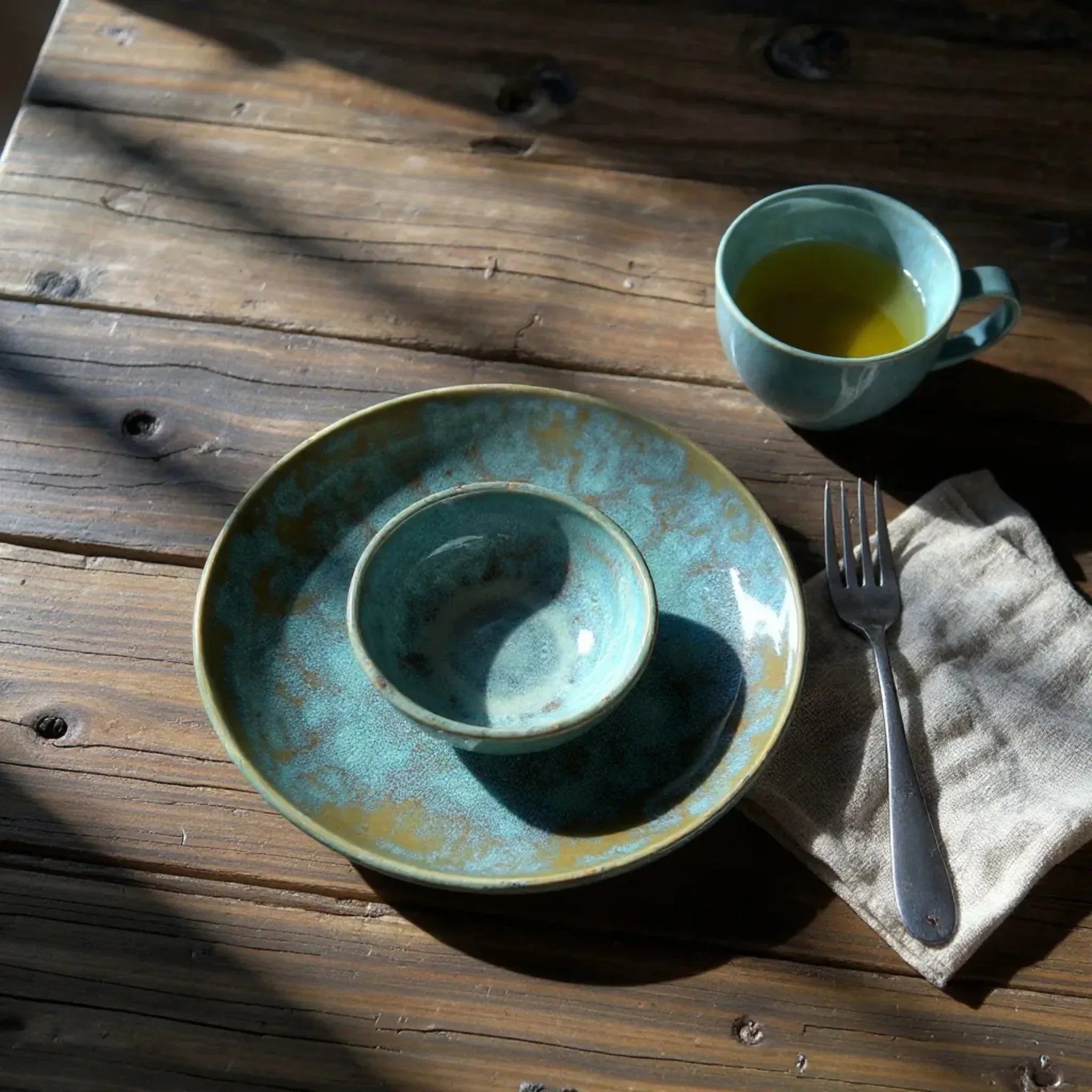
Start with earthy neutrals like warm whites or soft sands to let the bolder colors breathe. A piece like the Wabi Sabi Plate creates a necessary moment of calm. Its creamy finish acts as a canvas, allowing the richer tones to pop without overwhelming the senses.
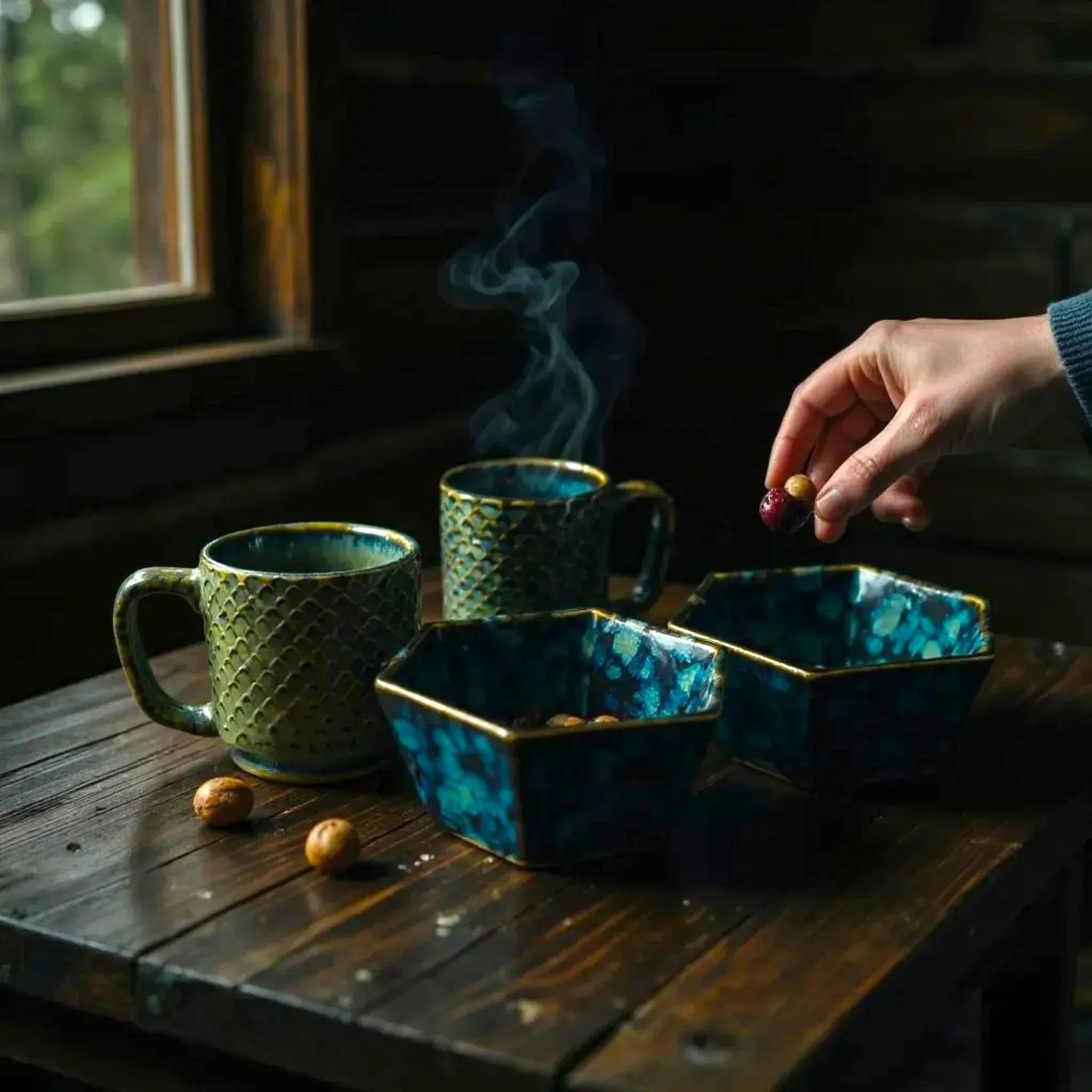
2. Layering Depth with Teal

Incorporate teal as your "anchor." A set of deep teal bowls or a statement piece like the Oceanstone Dinner Set draws the eye inward. Against a wooden table or a warm-toned runner, this colour feels almost inevitable, like a tide pool resting on sand. It adds a layer of "Quiet Luxury" that doesn’t demand attention but rewards it.
3. The Warmth of the "Golden Hour"

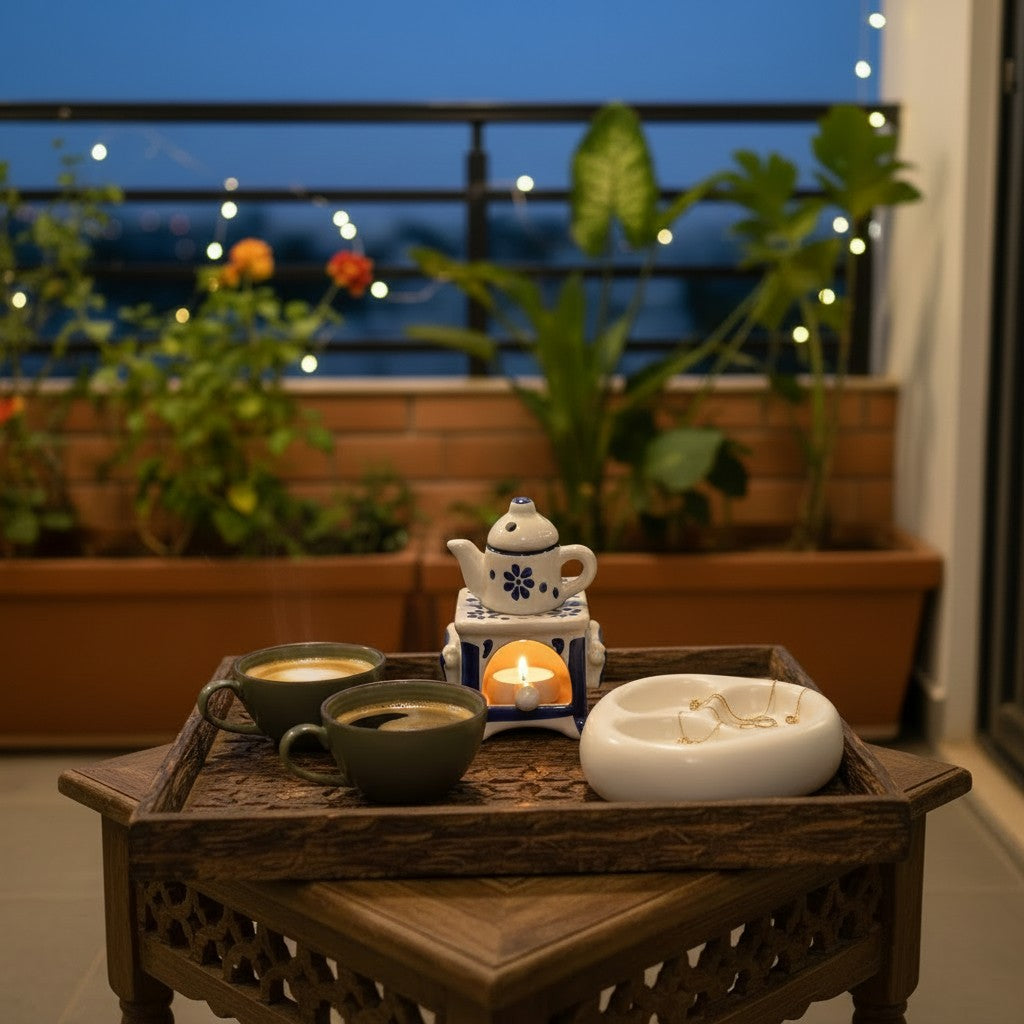
To keep the space from feeling too "cool," inject metallic and clay-toned warmth. The Terra Conical Espresso Set or the glow of a Vintage Amber Butter Dish catches the light as the sun goes down, shifting the mood from an energetic lunch to an intimate, candlelit dinner.
The Mood You’re Creating
A dining space dressed in these tones says something very specific to your guests: Slow down. It suggests that the time spent at this table is worth protecting.
It’s not about achieving a "Pinterest-perfect" look; it’s about intention. Choosing colours that genuinely affect how we experience a space is one of the simplest ways to make everyday meals feel a little more nourishing.
Your table is set. Now, stay awhile.